These were the things I mentioned I was supposed to do this week:
Finalise BAcc & meet with SOA – kinda (stakeholders will need to give confirmation)
Design SOE (and EXD?) – SOE done!
Implement funnel – it’s done but it’s not working(it looks like there are some issues with the Goals page at Google Analytics so I also cannot troubleshoot it)
Finalise changes to Commencement, IAC – IAC done! Commencement still have some minor things
Ask to apply VWO to all school sites – nope
Launch Masters – nope
Here’s a breakdown of this week:
Monday
AM: Commencement changes, passing the SOA homepage assets, updated the BAcc homepage with the new assets
PM: SOE homepage, worked on tickets for 4 users, including the upcoming Finance intranet site, started with the funnel
Tuesday
AM to 4:30 PM: BAcc Changes. This took a lot of time because they original site had a lot of content (25+ pages), and I have to figure out how to consolidate and combine it under only 4 categories. I also continued to work on the funnel in between this.
4:30 PM onwards: SOE homepage, PhD homepage, BAcc homepage
Wednesday
AM: Commencement changes
PM: BAcc structure suggestions, team meeting, applied the funnel (finally)
Thursday
AM: Commencement changes, team meeting
PM: Utility Bar specs
Friday
AM: Navigation guidelines / specs, SOA Banners
PM: BAcc changes + prototype, SOA meeting, BAcc post-meeting changes
This work journal entry is a little late. This week was quite busy, especially because of our first social committee event. We also launched the new Academy website on Monday, so we spent a lot of time addressing some minor issues post-launch. Aside from this, I finally finalised (lol) the Commencement site. I believe it will be launched next week. Here’s how this week went down:
Monday
AM: Academy launch, spot/fix some bugs, downloaded stock photos for courses
PM: Master’s banner images, ‘Start your journey’ fix, drafted the Academy funnel
Tuesday
AM: Academy changes, thumbnails and finalised Academy funnel
This week we only had 4 working days because May 1 was the Labor day holiday. Here’s how the week went:
Monday
Applied all SOA changes & send to user for follow up
Updated the Academy guide
Tuesday
Labor day weekend.
Wednesday
Did a PPT presentation for social comms
1:1 meeting
Drafted the screens for the K2 to SAP integration. This is something new from the usual. The steps included the approval process from one unit to the Finance department.
Did some overtime work on the content styling for the Commencement site
Thursday
Fixed the sticky navigation bar for Commencement and sent it out to users for comments
Fixed the all caps titles from Academy
Team meeting
Afternoon meeting with social comms
Friday
Half the day spent working out the details for the upcoming social comms event next week
At around 3pm, our developer helped me add back the missing sliding banner module in theCommencementdev site (turns out I just needed to paste the master slider folder under modules), he also taught me how to create a new region (edited the info.yml and the page.twig.html files)
After this I tried to layout the plan for the GA sales funnel, but it looks like it’s not as straightforward as it seems, so I just proceeded to work on some tickets from Zendesk
Next Week
Monday: Academy site launch, Masters site changes, Finalize the edits and styles in Commencement, Draft the Academy event tracking/funnel test
Tuesday: start with BAcc changes, Social Comms meeting in the afternoon
Wednesday: finalize BAcc changes, start with SOE homepage and microsite
Thursday: finalize SOE studies,team meeting (share funnel, SOE homepage, updated Masters)
Friday: Social Comms event
Minor things: delegate form creation, reminder email for social comms, photo-editing tickets, add VWO to all school sites, verify K2 to SAP integration screens
This week I only had 3.75 ish working days because I fell ill. In fact, I would say it is even less than this because we had a few department-wide events. I don’t have my work laptop with me at the moment, so I will try to recall what I did throughout the week based on the emails I’ve sent.
I presented to my boss the current progress of the Commencement site and there are no major changes. With the help of one of the developers in our team, we have uploaded the drupal subtheme to dev environment. You can see the messy work in progress here: http://d8dev.commencement.smu.edu.sg/ The sliding banner is currently missing, and the navigation bar doesn’t work as expected – yet.
Early draft for the LKCSB school site homepage
Updated the business school mockups based on the references that the stakeholders gave
Tuesday
Today, the developer has finished uploading the Commencement site files, and now I can see the I have to copy & paste all the content to this new site. Good thing I’ve been using imgur for the images at the moment, so that I didn’t need to re-upload anything.
The second half of the day was spent on our townhall meeting. It’s around this time that I started feeling not so good. I had colds and I was just feeling lightheaded.
Sidenote: I’ve switched desks! I am closer to the window so I get a better view + more sunlight. I’ve also decluttered so my place is looking very cute right now.
Wednesday
Frankly, this day wasn’t very productive. I just started on fixing up more Commencement-related content (getting ready), and I paid extra attention to the venue map:
Thursday – sick leave
Friday
Spent most of the day looking through the Academy site and writing the guidelines for the content clean-up/population. I included some before/after picture examples so that included applying the changes myself and there were a few course photos that needed to be changed. I also have a medium-sized list of CSS tweaks that I am hoping to pass to our developer next week.
In the afternoon we had a celebration lunch for our ISO certification.
Finally got the access to our dev files. I am using Sourcetree as a Git GUI.
I also started on finalising the changes to the Accountancy school site mockups but unfortunately I did not get to finish.
Reflections & What I Could’ve Done Better
Overall, this week was a little slow for me. What I could’ve done better is to improve my pace, focus, and to take better care of myself!
Next week
In order to manage my time better, I’m going to try and finish minor tasks in 30 mins to an hour, and I will try to start my day by working on the major projects first.
Monday
UNIC Site (adhoc)
Finalize SOA changes
Ask to add VWO code to LKCSB/SOCSC
Sliders for Masters site
Improve on the Academy guidelines (add how-to’s and remove technical codes)
Start planning for google tracking for Academy
Reply to Yvonne & Karyn
Tuesday
Send/apply CSS tweaks for Academy, send google tracking plans
Button Up powerpoint
UNIC/Commencement site
1:1 meeting
Wednesday
Start SOCSC Homepage
Commencement content & styling
UNIC?
Set up vault
Thursday
Team meeting
Finishing touches Commencement & Academy site (send Commencement)
This week was mostly spent on the upcoming Commencement site and the upcoming Prinsep Street pages. Trying to build a Drupal site has got to be one of the most challenging things I ever have to do since I joined SMU.
Monday
sent the Academysearch listing pages to be developed
started helping to fix layout issues of a landing page for a newly renovated student hostel (Prinsep)
helped reorganise the Whistleblowing pages
managed to change the logo, and customize the navigation bar for the Commencement site, as well as styled the inner page header title + more layout customizations
worked overtime at the Korean cafe nearby because I wanted to figure out how to create a full-width responsive slider (I was unsuccessful)
Tuesday (PM half-day)
had a nextweb meeting at around 9-10AM
updated the Academy homepage to have the new testimonials block and new footer
missed the social comms meeting because I was on PM leave (I managed to pay my SSS contributions, though!)
Wednesday
Met with my co-social comms member regarding the upcoming event that we are leading
Added the styles for the dropdown menu for Commencement site, added the footer as well, continue to try forcing the slider to span the whole width of the browser window—to no avail!
Continued to help fix issues in the Prinsep landing page
Thursday
Continued to help fix issues in the Prinsep landing page
Short participation in the team meeting; then met with the Prinsep folks afterwards
Added all of the content in the Commencement site (responsive table for Schedule of Ceremonies and the video archives, a Medium-inspired layout for the ‘About’ page)
Finally managed to create a full-width, responsive slider (with the help of our developer) using Master Slider, but in doing so, had reset most of the styling progress & other customizations done this week so far. Instead of using only bootstrap as the base theme, I should’ve used the SMU base theme instead. This is the biggest facepalm moment for me in this task because using the SMU base theme resulted to more issues than I had initially expected.
Created the mockups for Academy‘s new inner pages (SF Series, Who We Are, Why Choose Us)
Friday
sent in the updated Academy search page
finished off the layout changes for Prinsep (they initially planned to ‘launch’ it today, but did not push through)
attended a candle-making workshop during lunch time
managed to bring back the Commencement‘s old navigation bar layout and hover effects (for Desktop, at least)
Reflections
Overall, this week was a little stressful and disheartening, mostly because of the Commencement site project. I’d spent so much time fixing it up, only for most of it to go to waste. I initially planned to hand it over for deployment this week (because this is the time when graduating students will be looking for the information about Commencement), but it seems it will go over until the end of week. Additionally, our developer will be away until Wednesday, so if I break something, there will be no one to help me.
What I Could’ve Done Better
Know when it’s time to ask for help. My biggest worry is that I am bothering our developer and wasting too much of his time. But when our developer spend 2 minutes fixing an issue that I’ve been trying to fix for 2 days, it is my time and effort that is being wasted. Next week, I will set a reasonable timeline for experimenting and trying to figure out stuff on my own, and if I exceed this, I should just go ahead and ask for help.
Prioritize ad hoc tasks based on the time it takes to accomplish it. If a task takes more than 15 minutes to finish, I should send an email to the requester, stating that I am working on it, and due to the current workload, that I can only finish it at so-and-so date (Also important: double the estimated timeline! Better to finish earlier than expected, than to set high expectations, only to fail to deliver.) The Prinsep and the Whistleblowing task are examples of ad hoc requests that should not have been prioritized over the major projects.
Next Week
Here is the ideal plan for next week:
Monday Morning: Update the mockup for the Business school website (and request to the developer to add a heatmap tracking code for this site)
Monday afternoon: Continue working on the Commencement & LKCSB (dropdown menu, responsive slideshow), and update supervisor on the process + follow-up SOA
Tuesday morning: Continue working on the Commencement & LKCSB
As of this writing, I have been with SMU for about a year & 2 months. Even though my superiors gave me really positive feedback and high remarks during the performance evaluation, I feel like I had disappointed them in some way.
They kept on mentioning that I was good for someone who just joined the company, or I was good for someone who had very little experience. Not that I was good, period. Since I joined the company, I have this constant feeling of not being able to live up to expectations (both mine & theirs), of being insanely under-qualified for my daily work, and of being out of place in the IT department (as a designer with no programming background, I actually am).
Here are some of the areas/projects in which I feel like I should have done better:
This project is part of a bigger committee that aimed to review the UX of all IITS-related projects. One of the deliverables is a UX site that can provide knowledge to all staff before starting a project.
Scoring. The committee had an idea to create checklists to evaluate if an interface passes the standards. The main problem is how to score this? How is one standard higher in points than the other? I suggested to measure it against the user experience hierarchy of needs. In spite of this, we still struggled to group the guidelines accordingly. In the end, I believe the checklists have not been used at all.
Hierarchy & card sorting. To get some insight on how to group the guidelines properly, I also conducted a card sorting amongst the committee members. It went fairly well, although it felt like the insights/value gained from the exercise is not enough to justify the effort and time required. I did get a chance to do another card-sorting for another project.
Visual design. Aside from re-writing some of the guidelines, I was also tasked to create visuals to complement it. Looking back, the visuals that I created weren’t completely bad, but I know I could do better.
Web design. I could say the same re: the visual design of the whole site – not bad, but could be better. We also had some trouble figuring out how to navigate the pages. I initially planned for next & previous buttons, but should they be for categories only or should they include guidelines? Now it is not evident that some guidelines can be clicked to reveal more. Additionally, when clicking a guideline, there’s no clear way to go back to the parent category (example).
Presenting in front of the whole department. No more than 3 months in and I still had the guts to speak about this project to the whole department. I won’t claim that I really had great presentation skills, but isn’t that one of the desirable traits of a designer?
Evaluating user interfaces. Another deliverable of the committee is a review of the 1 app from each team under the IT department. I never got around to doing this, and I hope to continue with this, and finish everything before this year ends.
Lessons learned:
Virtual card-sorting > Post-it notes and papers.
Better to fail fast than spend time perfecting a product, only to realize that no one will use it anyway.
It would have been more fruitful to test navigation patterns as well (side nav vs. top nav with dropdown)
If testing with few users (0-20), do not bother to record timings & other quantitative data, as the margin of error will be very high. It is better to record observations, quotes, incidents (for example, User A hesitated to click button B), etc.
Videos/great visuals would probably have made my presentation much more engaging.
Challenges for the UX Site 2018:
How to continue the apps evaluation & publish it in the site?
How to promote knowledge of user experience & how to promote the site itself (quarterly newsletters?)?
How to integrate the new web guidelines to the UX site?
The alumni mobile app isn’t exactly an app in itself. It’s integrated within the SMU mobile app, which is also not a native iOS app, but built using the kurogo platform. This posed some limitations that I was initially not aware of.
Visual design of the home screen. After an initial project kick-off meeting, I immediately began sketching the home screen based on the things that they wanted to see. As I would come to realize throughout the year, thou shalt not take the requirements list at face value. What the users think they need are different from what they actually need.
If I had put my pencil down then, and asked a few more questions, there is a better possibility that we would get to the actual goal, but because I was eager to show off my design chops, I ended up with so many wasted studies. We then took more time than necessary focusing on little details like the colors of the icons.
Home screen redesign. In the end, we had to re-do the home screen because the main purpose of the app became clear: it is not to show ALL of the features, but to showcase the alumni benefits and the new alumni virtual card. I’m quite happy with how the new home screen turned out, although there are still a few things that could have been improved.
Navigating inner pages. One of the limitations of the kurogo platform is that most of the features in its app are all going to be opened just their own browser. This is not good for features that require a few level of pages, because the back button will not work as expected. The alumni benefits is a good example of this. We reduced the steps required by bringing the categories upfront and adding a ‘Back to Listing’ button in the actual benefit page. Admittedly, this can also be improved, but as we were rushing towards an upcoming alumni event to launch the app, we had to make do with this solution.
Launch. Speaking of the alumni event launch, I joined the alumni event/launch to get feedback from the first users of the app. This is how we realized one of the main challenges in adaptation: the users need to remember their SMU email & password in order to use the app. The process of resetting their password proved to be too much of a hassle that people never bothered to install the app. After all, they didn’t attend the event to install some app, they were there to network and discuss business.
On-boarding. The alumni dept. also thought it was a good idea to add a few on-boarding screens, which means they didn’t think that the home screen was intuitive enough.
Lessons learned:
What the users think they need are different from what they actually need.
Do not be afraid to ask questions. See if there are any limitations with the technologies that will be used & what success for the business looks like, else there will be a lot of wasted work.
What can work for graphic design, might not always work for app design. (Timestamp overlay)
When testing, make sure that the prototype is as real as it can get (for example, we would’ve never thought to test the prototype by starting on the login screen).
Challenges for 2018: I don’t think we will be visiting this project again this year. Maybe if I play my cards right, finish all my goals as early as possible, I can revisit all the sites here and improve each. That would be the most satisfying thing. If I could, I would set up tracking to see how many actually redeems the benefits, and measure if any of the improvements increase the engagement/conversion.
The Centre for Management Practice site used to simply be a landing page for users to go to other sites (Perspectives, Asian Management Insights, and Asian Management Briefs). The revamp not only showed a facelift, but a transformation into an e-commerce site.
Latest & featured articles: Since the new website will be more than just a webpage. An added functionality would the integration of all the latest articles & cases from all the sites under CMP. In theory, showing the top 5 latest articles is a good idea, except the way they publish articles is all in one go, once a month. This results to all the latest articles having the same date. If I can do it all over again, I can probably make it so that it just says “Latest Articles from March 2018” or something along these lines.
Khan Academy offers free lessons on Javascript, among many other things. I’m interested on doing this to complement my freecodecamp progress (yes, I’m back at it again!)
Subtraction is blog about design, tech, and many other things as well.
The first thing that striked me is the use of great typefaces. Secondly, there are actually two types of navigation here. One is at the top, the main nav, and the bottom which are actually anchor links for the rest of the page.
I like that the user can stop the video. And that the search bar is revealed at the top without having to click on anything additionally.
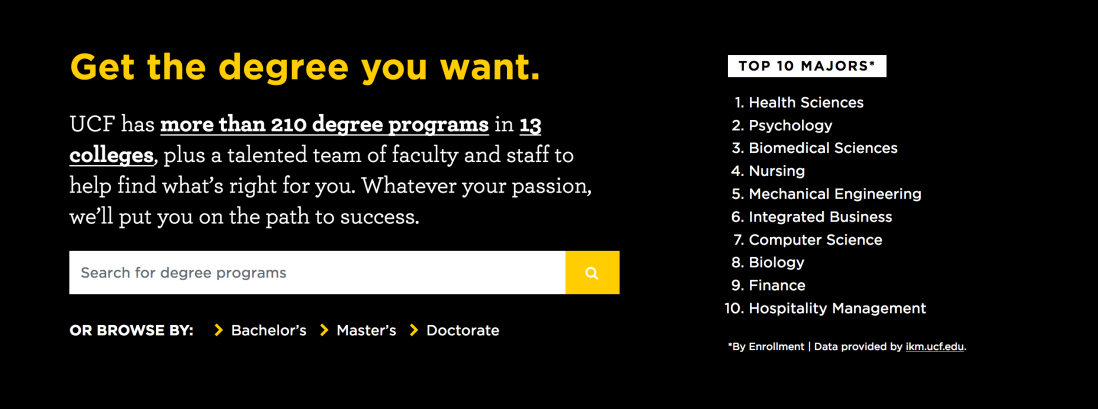
This is also a good way to encourage users to browse/search for degree programmes. Especially the copy that has links to all the degree programmes and the schools/colleges. That’s clever.
This presentation of the university facts are also quite succinct and simple. But one thing that is not present here are the accolades (it’s in the next section!).
4 news items, and an emphasis on a major accolade — not bad at all.
This block gives a huge city campus impression.
And the presentation of the different schools/colleges are visually appealing.
At the top of my head, here are the top new things that stuck to me from UXSEA’s event today:
Prototyping a mobile app on keynote. First of all, it never occurred to me that I could resize keynote slides to imitate smartphone screens. I also didn’t know that it was possible to manipulate shapes, to use ‘links only’ settings, and to airdrop the presentation to my phone so I can test it on a real device. It’s super simple and it seems ever more powerful than marvel!
Adding time goal to some of your slides (for example, if you estimate that you’ll arrive at a specific slide 15 minutes in a presentation that starts at 3:00 PM, you write 3:15 in the bottom of that slide) seems to be a good way to tell if you’re running out of presentation time or if you’re on the right track.
‘Sometimes, the best framework is no framework.’ One of the speakers said that there was an instance wherein he did user interviews and shared it to the rest of the team through a Facebook group that he created.
User research is more than just usability testing. This isn’t necessarily new, but it’s a good reminder that, at its best, user research would help form the strategy of a company. It’s more than just deciding which features to build, too.
It helps further your goals if you learn business (and how to set/meet business goals) & use management/leadership-speak when talking to stakeholders.
Design Sprint in Under 2 Hours
The first session condensed a 5-day design sprint in 2 hours. Here are the slides from Borrys Hasian.
We skipped the first few activities and jumped straight to defining a problem and creating a user journey map.
It’s good to remember that we should not neglect the offline experience, even if we are designing for an online one. Laying out both offline and online experience can reveal opportunities that we didn’t really think about.
After this, the group individually wrote How Might We’s based on the map. The problem given to us was to create a fun & informative online shoe shopping experience for young women who are trying to get into fitness. Some of the HMW’s that arose were:
How might we let the user ‘try’ on the shoes to see if it looks good on them?
How might we make it easier to compare products?
How might we make waiting for the parcel to arrive a more pleasant and less anxiety-inducing experience?
We then did some silent voting, and picked the second item in the list above. Once we have picked a focus, we can now think about different solutions using Crazy 8s. We ran out of time, but some of the activities after this include defining how to measure success (see HEART framework), thinking hats, and of course, prototyping and testing.
Lean UX in Practice
Here are some of the slides from Yan Lim’s talk:
When to Use Which Research Methods
This topic is the main reason why I wanted to attend this workshop. The speaker, Yoel Sumitro, did not disappoint.
Here are some of my notes from his talk.
The speaker presented the different ways to classify research methods. First is by objective:
Foundational – establishing an understanding about the subject or product that one is going to work on. For example, in the course page example, I could ask: what do we need to know about certifications, training hours, bursaries, etc? How does skillsfuture work?
Evaluative – Reviewing your product, finding out which areas can be improved further.
Then there’s also the qualitative (why) vs. quantitative (what and how) research, and behavioral vs. attitudinal.
A list of research methods
It was my first time to hear about conjoint analysis, which seems complicated, but a interesting method to learn more about. Cultural immersion & house visits (for some guidelines for this method, see Solomon Asch’s Social Pressure and Conformity) sounded like a really interesting method of research, although based on my experience attending events like these, it’s something that only designers/researchers in bigger startups have the luxury to do.
The speaker touched a little bit on eye tracking (note: this method needs a minimum of 30 participants), and why it is only necessary to tracks these patterns if you cannot get the information that you need from usability testing. He also shared a few tips on writing surveys:
Make it short
Use quantifiable values (e.g. instead of ‘sometimes’, use ‘1-2x a week’)
Leave the demographic questions towards the end so it doesn’t turn people off, and don’t make everything mandatory
Instead of giving an ‘I don’t know’ option, use ‘Others, specify:’
If a user has not responded to a survey yet, send a follow-up email no less than 3 days later
Lastly, the speaker touched a little bit on triangulation and why it’s always better that there’s a mix of qualitative and quantitative methods in the research that you do.
Overall, the workshop was informative and inspiring. It was actually more like a seminar and less like a workshop, but it was fun!


 CMP Commerce Site

 4 news items, and an emphasis on a major accolade — not bad at all.
 This block gives a huge city campus impression.
 And the presentation of the different schools/colleges are visually appealing.


