Quick background
Aside from undergraduate & postgraduate courses, SMU offers a wide range of short courses that are targeted towards working professionals and executives. As the number of short courses grew, so did the number of course providers.
Individual centers, schools and departments can have their own short courses. This resulted in a disjointed, inconsistent experience and poor discoverability, because there isn’t one place where one can see all of SMU’s course offerings.
Solution
This project aims to solve this problem by:
- bringing all these courses under one generic and self-explanatory label called ‘Professional & Continuing Education’ (PCE)
- creating a search and filter functionality that includes all PCE courses (basically, to redesign this page), and
- standardizing the template for all courses, which I will focus on in this case study
Standardizing the Content
The core team (consisting of a designer, a developer, the web & media team lead, and a representative of the Office of the Provost) examined the existing course pages and highlighted the most common content among them.
Some of the similar content are consolidated (e.g ‘Why you should take this course‘ and ‘Benefits‘ or ‘Takeaways‘), some were marked required and others optional. This resulted to a draft template that is still on the process of going back and forth with different stakeholders. Nevertheless, we can now start working on the next step, which is to visualize how this template will actually appear in a course page.
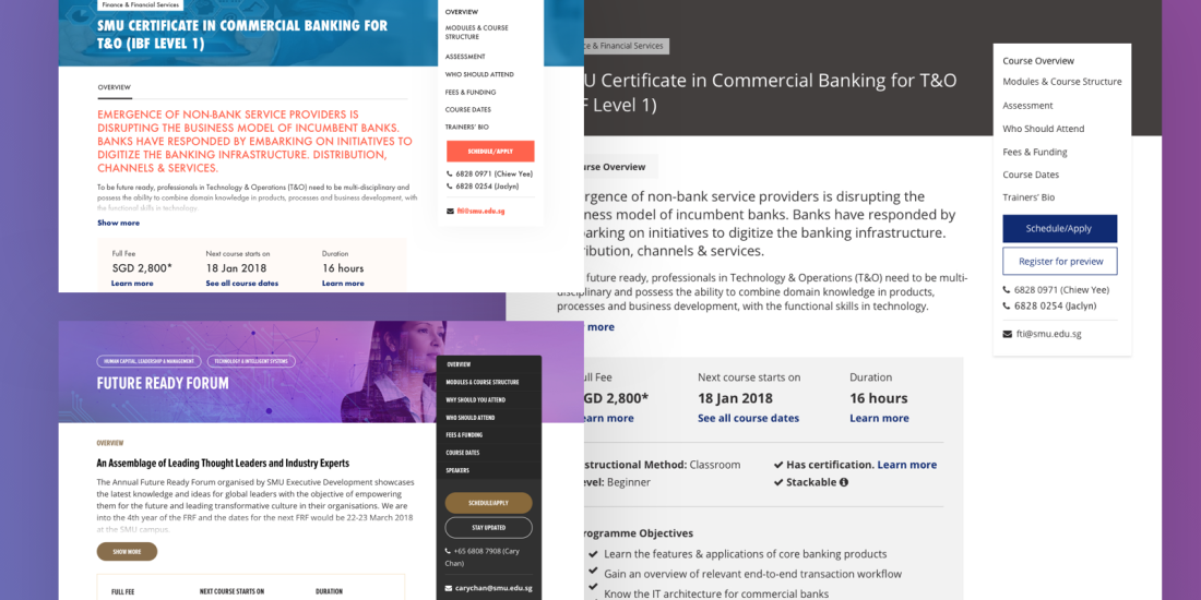
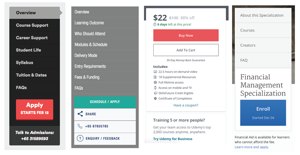
Reviewing Best Practices
- The sticky sidebar is a common element used in almost all our references, one way or another. While it makes navigating long pages easier, it also limits the number of sections (around 6-8 only) that can be in the sidebar, because the entire thing should be visible. This limitation can be a good thing, because course providers are then urged to make sure that the pages are not too long, and that unnecessary information are edited out (kinda like Twitter’s character limit!)
L-R: General Assembly, IAL, Udemy, Coursera - Improving readability through lists, succinct sentences & keywords, icons, and whitespace is something that can be seen throughout many good course pages. Users should be able to quickly scan through the important details, to see if this is the right course for them. I also made note of which pieces of information are usually lumped together, so we can further consolidate our template.

Top left to right: Udemy, Coursera, IAL, Skillsfuture website - Simplified pricing tables. While the table on the left provides more information on how the fees are computed, the table on the right is less intimidating and easier to scan. I definitely have a bias towards the right, but this is a good opportunity to test which works better for the target users.

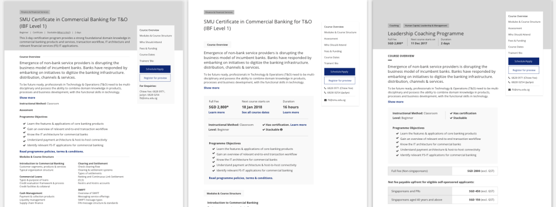
Left: Lithan, Right: IAL
First Iteration & Design Considerations
(To be continued…)


