Takeaways from CoDE-2017 Summit’s Full Day UX Workshop

CoDE banner

At the top of my head, here are the top new things that stuck to me from UXSEA’s event today:

  1. Prototyping a mobile app on keynote. First of all, it never occurred to me that I could resize keynote slides to imitate smartphone screens. I also didn’t know that it was possible to manipulate shapes, to use ‘links only’ settings, and to airdrop the presentation to my phone so I can test it on a real device. It’s super simple and it seems ever more powerful than marvel!
  2. Adding time goal to some of your slidesĀ (for example, if you estimate that you’ll arrive at a specific slide 15 minutes in a presentation that starts at 3:00 PM, you write 3:15 in the bottom of that slide) seems to be a good way to tell if you’re running out of presentation time or if you’re on the right track.
  3. ‘Sometimes, the best framework is no framework.’ One of the speakers said that there was an instance wherein he did user interviews and shared it to the rest of the team through a Facebook group that he created.
  4. User research is more than just usability testing. This isn’t necessarily new, but it’s a good reminder that, at its best, user research would help form the strategy of a company. It’s more than just deciding which features to build, too.
  5. It helps further your goals if you learn business (and how to set/meet business goals) & use management/leadership-speak when talking to stakeholders.

Design Sprint in Under 2 Hours

The first session condensed a 5-day design sprint in 2 hours. Here are the slides from Borrys Hasian.

mapping.jpg
We skipped the first few activities and jumped straight to defining a problem and creating a user journey map.

It’s good to remember that we should not neglect the offline experience, even if we are designing for an online one. Laying out both offline and online experience can reveal opportunities that we didn’t really think about.

After this, the group individually wrote How Might We’s based on the map. The problem given to us was to create a fun & informative online shoe shopping experience for young women who are trying to get into fitness. Some of the HMW’s that arose were:

  • How might we let the user ‘try’ on the shoes to see if it looks good on them?
  • How might we make it easier to compare products?
  • How might we make waiting for the parcel to arrive a more pleasant and less anxiety-inducing experience?

We then did some silent voting, and picked the second item in the list above. Once we have picked a focus, we can now think about different solutions using Crazy 8s. We ran out of time, but some of the activities after this include defining how to measure success (see HEART framework), thinking hats, and of course, prototyping and testing.

Lean UX in Practice

Here are some of the slides from Yan Lim’s talk:

slide1.jpg

slide2.jpg

When to Use Which Research Methods

This topic is the main reason why I wanted to attend this workshop. The speaker, Yoel Sumitro, did not disappoint.

notes.jpg
Here are some of my notes from his talk.

The speaker presented the different ways to classify research methods. First is by objective:

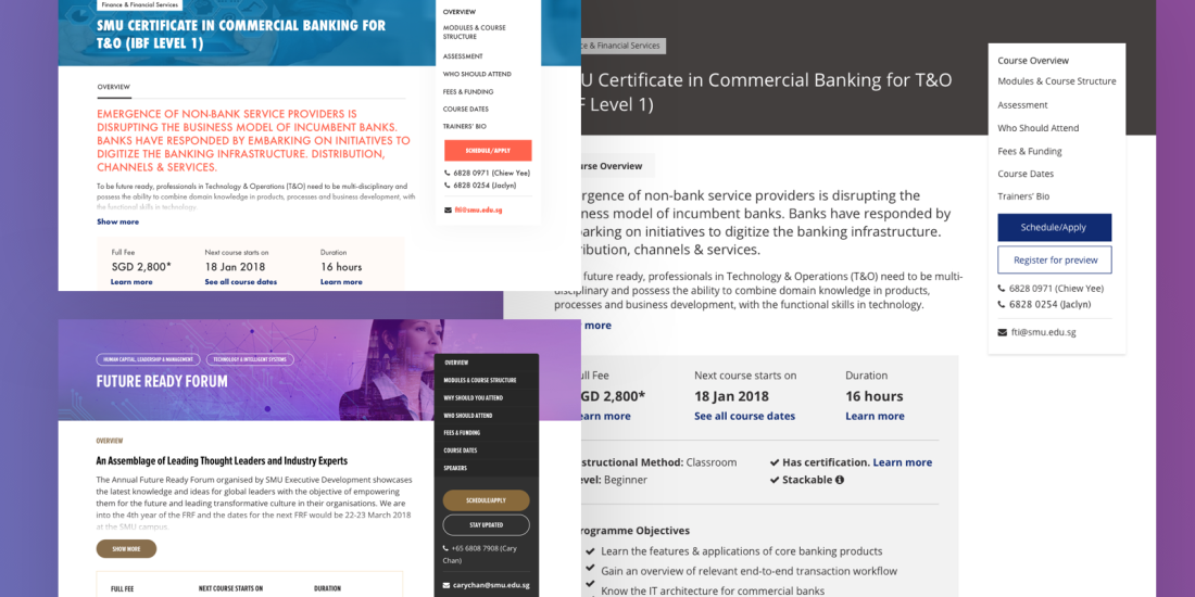
  1. Foundational – establishing an understanding about the subject or product that one is going to work on. For example, in the course page example, I could ask: what do we need to know about certifications, training hours, bursaries, etc? How does skillsfuture work?
  2. Exploratory
  3. Generative
  4. Evaluative – Reviewing your product, finding out which areas can be improved further.

Then there’s also the qualitative (why) vs. quantitative (what and how) research, and behavioral vs. attitudinal.

user research methods.jpg
A list of research methods

It was my first time to hear about conjoint analysis, which seems complicated, but a interesting method to learn more about. Cultural immersion & house visits (for some guidelines for this method, see Solomon Asch’s Social Pressure and Conformity) sounded like a really interesting method of research, although based on my experience attending events like these, it’s something that only designers/researchers in bigger startups have the luxury to do.

The speaker touched a little bit on eye tracking (note: this method needs a minimum of 30 participants), and why it is only necessary to tracks these patterns if you cannot get the information that you need from usability testing. He also shared a few tips on writing surveys:

  1. Make it short
  2. Use quantifiable values (e.g. instead of ‘sometimes’, use ‘1-2x a week’)
  3. Leave the demographic questions towards the end so it doesn’t turn people off, and don’t make everything mandatory
  4. Instead of giving an ‘I don’t know’ option, use ‘Others, specify:’
  5. If a user has not responded to a survey yet, send a follow-up email no less than 3 days later

Lastly, the speaker touched a little bit on triangulation and why it’s always better that there’s a mix of qualitative and quantitative methods in the research that you do.


Overall, the workshop was informative and inspiring. It was actually more like a seminar and less like a workshop, but it was fun!

Designing a Course Page Template (Part 1)

Quick background

Aside from undergraduate & postgraduate courses, SMU offers a wide range of short courses that are targeted towards working professionals and executives. As the number of short courses grew, so did the number of course providers.

course page template blog-2
Top: SMU Academy Course Page, Bottom: SMU ExD Course Page, Right: Wireframe

Individual centers, schools and departments can have their own short courses. This resulted in a disjointed, inconsistent experience and poor discoverability, because there isn’t one place where one can see all of SMU’s course offerings.

Solution

This project aims to solve this problem by:

  1. bringing all these courses under one generic and self-explanatory label called ‘Professional & Continuing Education’ (PCE)
  2. creating a search and filter functionality that includes all PCE courses (basically, to redesign this page), and
  3. standardizing the template for all courses, which I will focus on in this case study

Standardizing the Content

The core team (consisting of a designer, a developer, the web & media team lead, and a representative of the Office of the Provost) examined the existing course pages and highlighted the most common content among them.

Some of the similar content are consolidated (e.g ‘Why you should take this course‘ and ‘Benefits‘ or ‘Takeaways‘), some were marked required and others optional. This resulted to a draft template that is still on the process of going back and forth with different stakeholders. Nevertheless, we can now start working on the next step, which is to visualize how this template will actually appear in a course page.

Reviewing Best Practices

  • The sticky sidebar is a common element used in almost all our references, one way or another. While it makes navigating long pages easier, it also limits the number of sections (around 6-8 only) that can be in the sidebar, because the entire thing should be visible. This limitation can be a good thing, because course providers are then urged to make sure that the pages are not too long, and that unnecessary information are edited out (kinda like Twitter’s character limit!)

    sticky sidebar.png
    L-R: General Assembly, IAL, Udemy, Coursera
  • Improving readability through lists, succinct sentences & keywords, icons, and whitespace is something that can be seen throughout many good course pages. Users should be able to quickly scan through the important details, to see if this is the right course for them. I also made note of which pieces of information are usually lumped together, so we can further consolidate our template.

    Screen Shot 2017-12-16 at 12.45.05 AM.png
    Top left to right: Udemy, Coursera, IAL, Skillsfuture website
  • Simplified pricing tables. While the table on the left provides more information on how the fees are computed, the table on the right is less intimidating and easier to scan. I definitely have a bias towards the right, but this is a good opportunity to test which works better for the target users.

    pricing tables.png
    Left: Lithan, Right: IALĀ 

First Iteration & Design Considerations

design explorations.png
Early design explorations

(To be continued…)

Notes on Design Bootcamp Asia #15: Real UX Research Practices That Work

highres_466273926
Photo grabbed from the meet-up page. Learn more about the speakers here.

Today’s event was packed – lessons-wise and crowd-wise. Wei Lieh Ng, a UX practitioner from Starhub, shared tips on how to get the most out of a limited research window:

  1. Right method at the right time. Basically, one has to be mindful of what research method to use at any given point of a product lifecycle. He shared this image of a landscape of 20 research methods from NN/g, but this screenshot sums it up better:

    when to use what research method
    When to use the various methods of user research (Credit: NN/g, https://www.nngroup.com/articles/which-ux-research-methods/)
  2. Continue reading “Notes on Design Bootcamp Asia #15: Real UX Research Practices That Work”

An Introduction

Before anything else, just an introduction: I’m Celena and I’m a designer.

I have started off as a graphic designer, working immediately after I graduated in mid-2014. My work as an in-house graphic designer focused mostly on digital marketing. I did all sorts of things (social media posts, powerpoint slides, flyers, websites, landing pages, animated videos, and many more) for almost 2 years guided by 2 other talented designers, who mostly worked on the UI & UX for a product within the same company.

This first exposure to user interface & user experience design led me to work on a couple of UI/UX projects on the side (for the same company), but most of which never got to see the light of day. I never had any formal education or training for UI/UX, save for a couple of online courses and articles online. Around the first half of last year (2016), I was the only designer left who had somehow worked with the product (and not just marketing) design, so I was promoted to UI Design Lead, and another designer was hired to be my “team”. We worked on a few projects, some of which were shipped.

After a short 6-month stint as a UI Design Lead, I joined Singapore Management University as the sole Web & UX Designer of its in-house Web & Media Team. I started early this year, and here are some of the projects that I’ve worked on throughout 2017 (quick disclaimer: I know the following projects are far from perfect, I just wanted to list them here not as inspiration, but just to remind myself on the things that we’ve worked on for the year):

  • ux.smu.edu.sg, a collection of user experience guidelines, mainly used as reference for third-party agencies who are hired to build and design websites for various units under the university
  • oralhistory.smu.edu.sg, a redesign of an old website that contains video interviews from the leaders & pioneers of the university
  • cmp.smu.edu.sg, a redesign of the Centre for Management Practice website that hopes to highlight the actual content of its sub-units and to include e-commerce functionalities (this is still a work in progress)
  • studentservices.smu.edu.sg, a website for the newly formed Student Services Hub, which aims to make it easier for students to find info on the services around the university
  • a redesign of the main SMU website, starting with removing the megamenu for some sections (About, Campus Life) and replacing these with landing pages

My first year in this new job is coming to an end soon, and I just want to make sure that I learn from my experiences. Thus, this blog! I intend to write mini case studies that record the considerations for my design decisions and the challenges that I tried to overcome, as well as some notes on the events that I attend, the books that I read, the courses that I take, the inspiration that I stumble upon and so on. I’ve unwittingly done this on my personal blog, actually, so let me just link it here:

This blog is mostly a documentation for myself, but I do hope that my posts can help other designers, especially print or digital designers who are hoping to make the transition to UI/UX.


TL;DR: I’m Celena, a designer with 3 years of experience, half of which as a digital graphic designer, and the other half as a web UI/UX designer. This documentation is for me because I have really poor memory and my thoughts tend to get jumbled a lot, but I hope other designers can find my future posts useful.